
Opel direct sales
New Opel Italy online journey for buying new pre-built vehicles
Client:
Devices
Sector
My Role
UX / UI Designer
Desktop / Mobile / Tablet
Automotive industry
Opel
The next phase of Opel’s direct sales journey in Italy was an exciting evolution—offering new pre-built (stock) cars that were already configured and ready for purchase. I joined the project to help design and implement the new user experience, ensuring that the process was intuitive, seamless, and optimised for customers looking to purchase stock cars. The goal was to create a user-friendly path that mirrored the ease and convenience of buying directly from Opel while enhancing the brand’s digital sales capabilities.
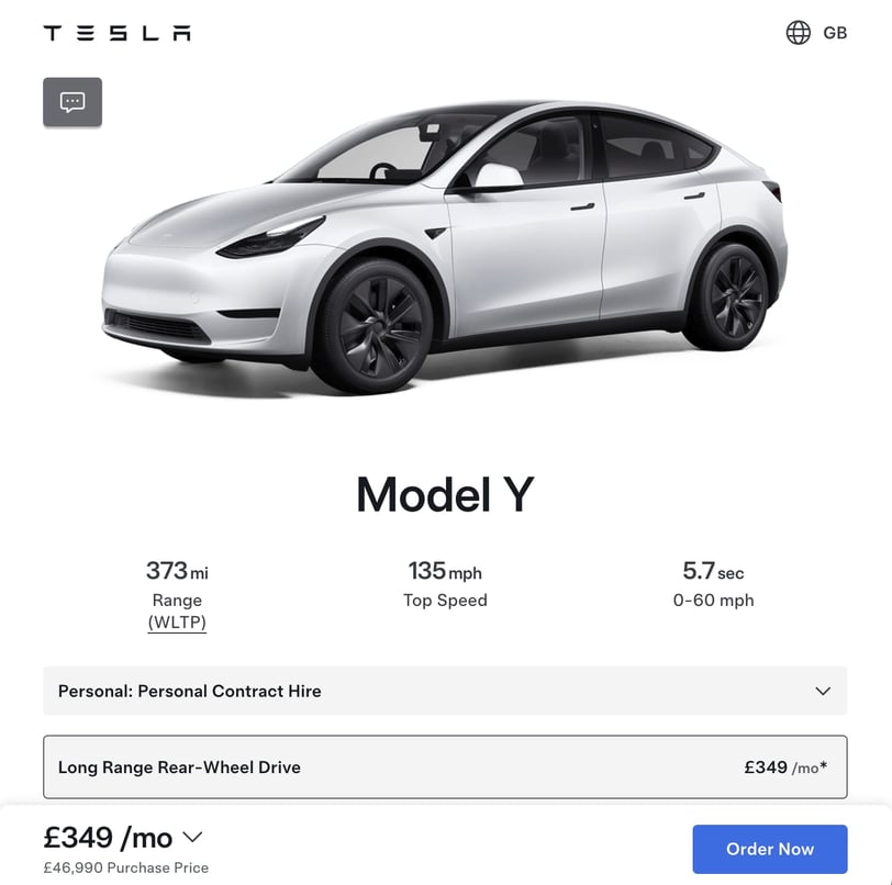

Traditionally, car manufacturers such as Opel relied on dealerships as the primary channel for selling their vehicles. However, with the rise of Tesla’s direct-to-consumer sales model, other manufacturers, such as Opel, began following suit by establishing their own direct sales platforms through their branded websites. Opel had already launched its direct sales model in Italy, but at the time, it was limited to build-to-order cars, allowing customers to customise and order vehicles that were then manufactured specifically for them.
Background
Before beginning any design work, the first critical step was to gain a thorough understanding of the existing build-to-order car journey on the Opel Italy site. This involved breaking down the front-end user experience, examining the underlying technology stack, mapping out the API connections that drove data flow, and analysing the dependencies across key systems, including checkout and payment processes. This comprehensive assessment was vital because it defined the framework in which the new stock car purchasing journey would be developed. To achieve this, I collaborated closely with stakeholders, the product owner, domain experts, and the tech team, using virtual whiteboarding sessions to map how all components fit together.
Understanding the problem
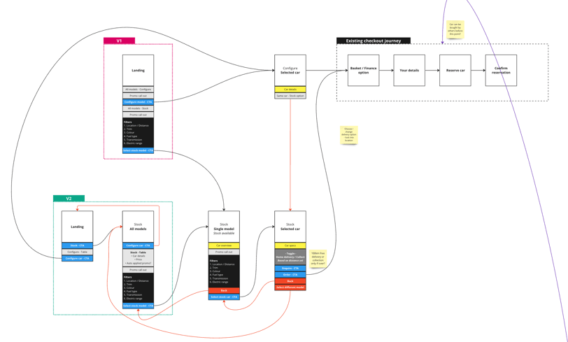
By familiarising ourselves with how the current system operated, we uncovered both the opportunities and limitations that would shape the design of the new experience. My objective was to ensure the new stock vehicle purchasing journey integrated seamlessly into the established build-to-order process, allowing for a unified, effortless experience for customers, whether they were configuring a custom car or selecting from pre-built inventory.

My design approach
Before any medium to high fidelity designs, I started by sketching out user flows. This initial step was crucial for visualising how the user journey might unfold, allowing us to see how the underlying technology connected, identify dependencies, and spot potential pain points or overlooked details early on. Creating these flows at the outset enabled me to design quickly and more importantly fail fast, an essential part of the process.
By identifying what worked and what didn't work early on, we gained valuable insights without committing significant time or resources, ultimately saving both. This approach accelerated the iteration process and ensured the team refined and perfected the user experience before moving into more detailed design and development stages.

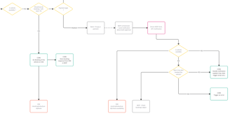
With a solid understanding of the new stock car ordering journey in place, it could have been tempting to jump straight into high-fidelity designs, especially when working under the kind of time pressure this project entailed. However, I chose to begin by creating quick low-fidelity wireframe mockups. This approach allowed me to map out the entire information architecture across the journey, ensuring that all elements were properly structured from the start. Just as importantly, these lo-fi wireframes enabled me to quickly work through page layouts, user interactions, and key decision points.
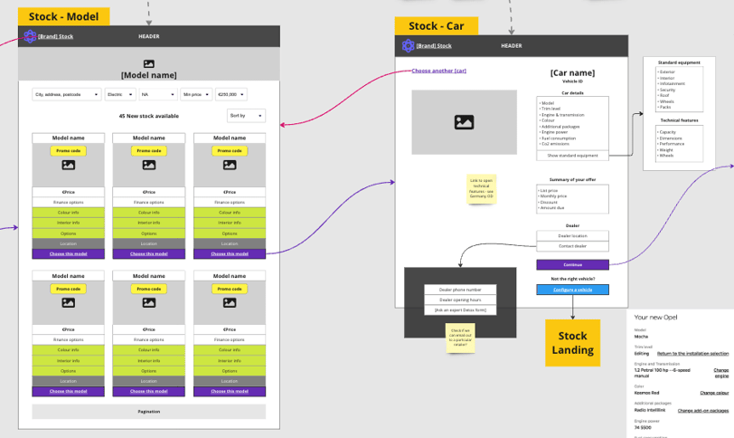
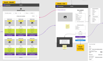
Lo-fi mockups
By taking this step, I was able to identify any potential issues or areas for improvement early on in the design stage. If changes were necessary, adjustments could be made swiftly, without the added time or effort of reworking detailed, high-fidelity designs. This lean approach ensured that the design process remained agile and allowed for rapid iteration and feedback, ultimately reducing the risk of costly revisions later in the project. The wireframes served as a flexible blueprint that guided the project forward, laying the foundation for more polished, high-fidelity designs while maintaining momentum in a time-sensitive environment.
Clickable prototypes
In Figma, I created high-fidelity clickable prototypes that provided a realistic representation of the final product prior to any coding. This prototype served as an essential communication tool, allowing me to convey the look, feel, and functionality of the final design to stakeholders with clarity. The prototype offered developers a clear understanding of the required features and functionalities, ensuring that everyone was aligned on the project vision.
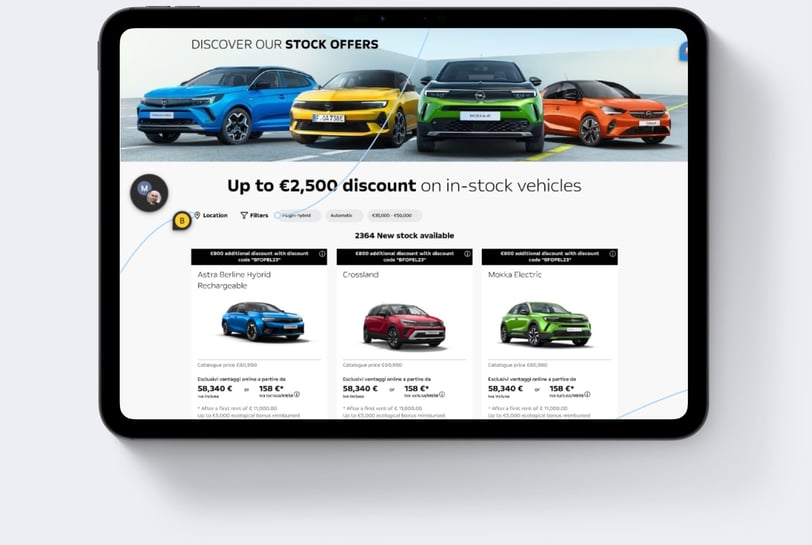

Additionally, a version of the prototype was utilised for user testing, enabling us to gather invaluable feedback from real users. This testing phase allowed the team to identify key areas for iteration and improvement. The insights gained from user interactions also enhanced our understanding of user needs and facilitated a more efficient and focused approach to development, ultimately ensuring that the final product would meet both user expectations and project goals. This iterative process reinforced the importance of collaboration among design, development, and stakeholders, laying a strong foundation for a successful product launch.
The outcome
My design process, which began with an in-depth exploration of critical user journeys followed by the creation of low-fidelity mockups at an early stage, proved instrumental in enabling rapid design iteration. This approach not only saved the team from costly rework or last-minute changes later in the project but also allowed us to refine the product continuously. By adopting this method, both the team and stakeholders were able to explore a wider range of design possibilities and provide invaluable feedback at the formative stages of development.
This collaborative, iterative approach ensured that potential issues were identified and addressed early, streamlining the decision-making process. It also enabled me to design a seamless and efficient user journey for the Opel stock vehicle ordering system, which integrate effortlessly with the existing build-to-order journey. The end result was a cohesive, user-centred solution that maintained consistency across both customer experiences.
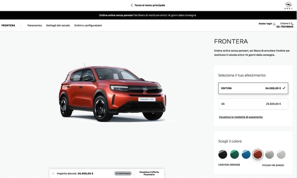
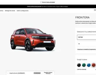
Delivering frictionless User-Centric experiences for Web, Mobile, and Tablet
My Contacts
Shoot me a message
kalun@kalunlaudesign.com
© 2024 Kalunlaudesign Limited
