
MyDyson App
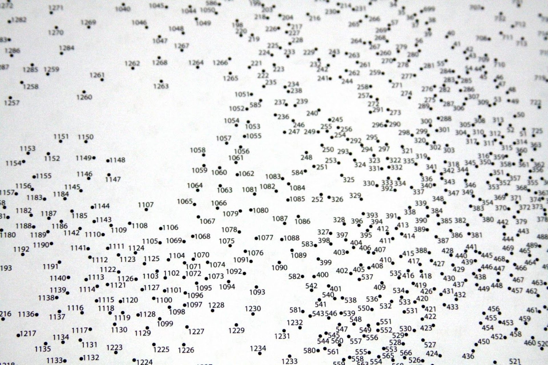
A challenge to join the dots
Client:
Devices
Sector
My Role
UX Architect
Desktop / Mobile
Tech / IoT / Smart Devices
Dyson
Link
MyDyson provide the following key features:
Remote Control and Monitoring
Users can manage Dyson products like robot vacuums or climate control from anywhere.
Personalised Configuration
Customise settings such as cleaning schedules or temperature preferences.
Data and Performance Insights
Get real-time data on air quality or cleaning history to optimise device efficiency.
Maintenance Alerts
Receive notifications for filter changes, software updates, and maintenance needs.
Smart Home Integration
Supports voice control with Amazon Alexa and Google Assistant.
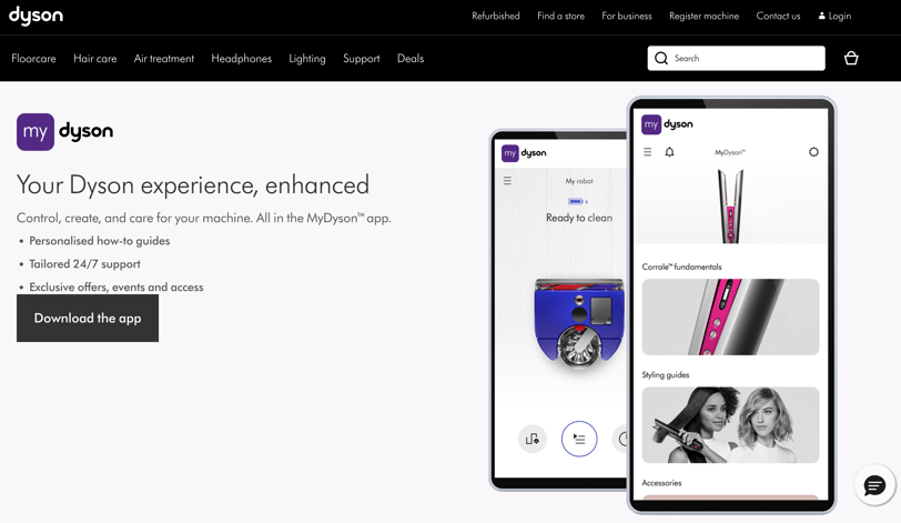
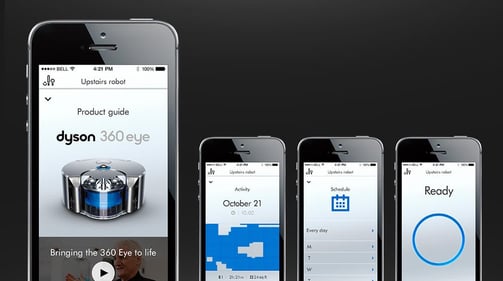
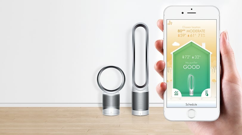
Dyson launched the MyDyson app, designed to enhance user interaction with their smart-enabled products such as air purifiers, heaters, and robot vacuums. The app serves as a central hub for users to configure, control, and gain insights into their devices, improving both convenience and performance.
Background
MyDyson app’s initial design and development were outsourced which introduced challenges related to communication, coordination, and quality control. Multiple teams were involved in the development process over an extended period, resulting in a fragmented app experience that felt disjointed and lacked coherence.
Understanding the problem
Inconsistent Design Language: Each team appeared to have followed its own design approach, leading to a lack of uniformity across the app. Fonts, colours, icons, and overall UI elements differed from screen to screen diminished the app’s aesthetic appeal and confused users.
Incomplete or Fragmented Design System: While there may have been an effort to establish a design system, it was poorly implemented and not fully integrated. This resulted in a fragmented design system with inconsistencies between buttons, forms, and layouts which made the user experience unpredictable and hard to navigate.
Technological Fragmentation: The use of different backend and frontend technologies further exacerbated the issue. These systems may were not compatible or well-integrated, causing data issues, performance bottlenecks and failures in features.
User Experience Impact: The cumulative effect of all these inconsistencies created a poor user experience. Users found the app unintuitive, difficult to navigate, and unreliable. This led to frustration, as features didn't work as expected, and the overall interaction with the app felt awkward and unfinished. The lack of coherence undermined trust in the app’s functionality and ultimately in the Dyson brand.
Joining the dots
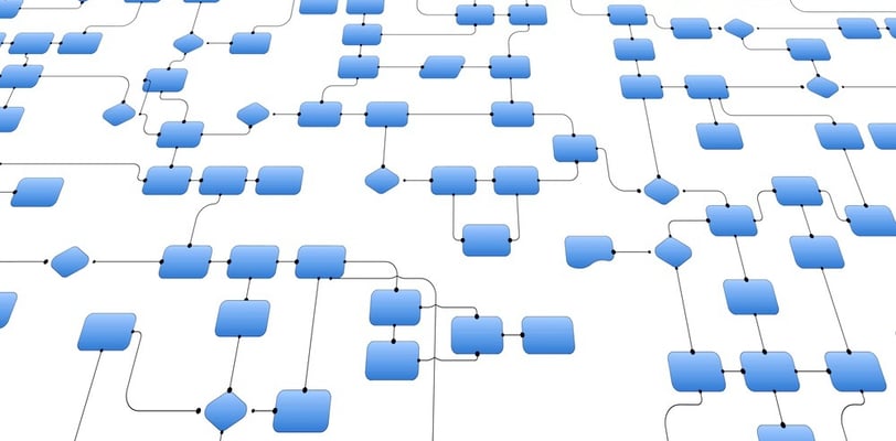
My first step to improve the MyDyson app was to understand its existing design by mapping out the information architecture (IA), essentially joining the dots. This involved reverse engineering that had already been developed to connect the various parts of the app. By doing this, I created a comprehensive view of how the app is structured, how its features are connected, and how users navigate through it.
Reverse Engineering Existing Development: By breaking down the app’s current state, my goal was to understand the design and technical choices that were made, providing a clearer picture of how everything fits together.
My approach
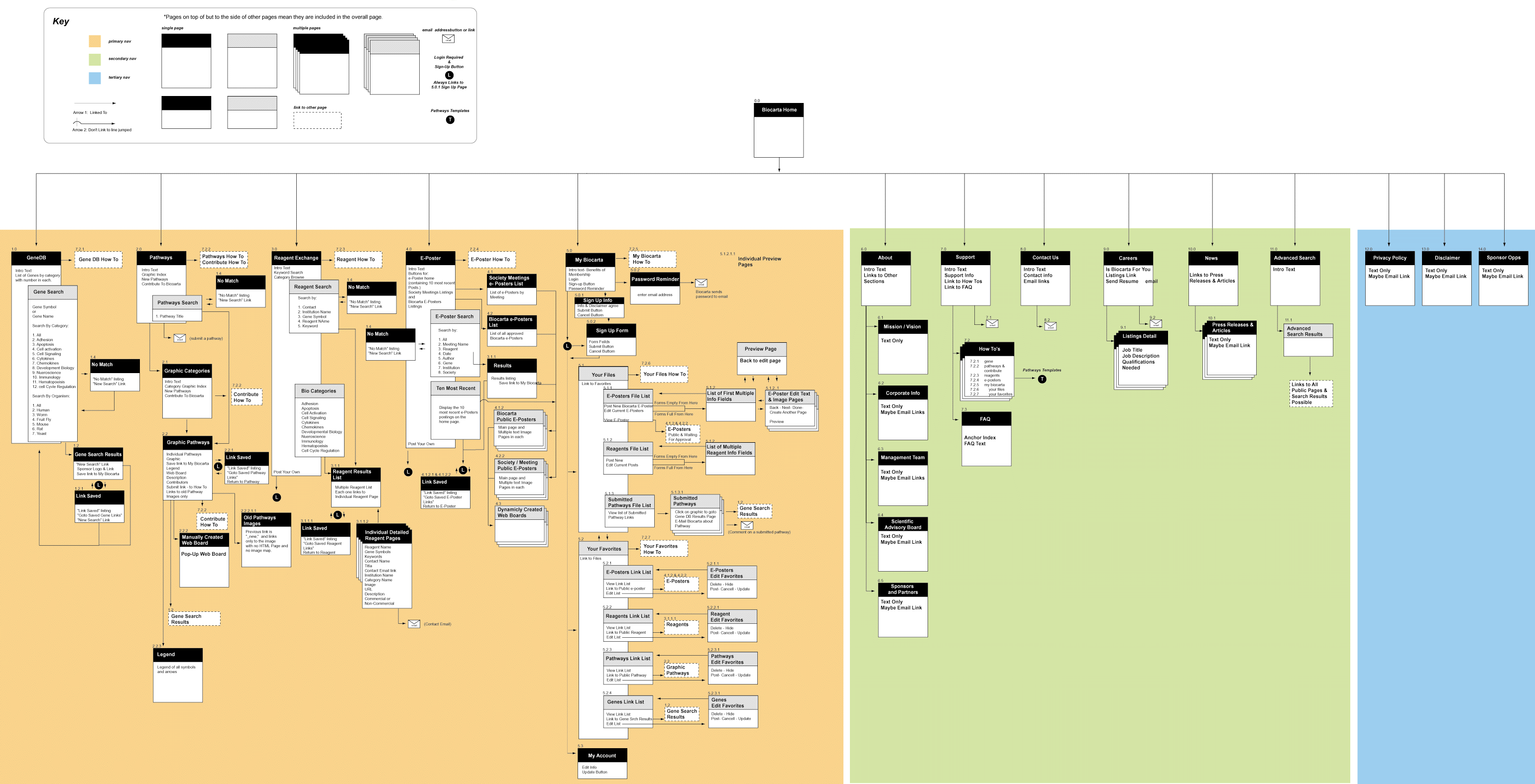

Information Architecture Mapping: By mapping out the IA of the MyDyson app, I could then visualise the relationships between different sections, screens, and features. This allowed me to identify redundancies, inconsistencies, and gaps in the app's flow, which is critical for improving the overall user experience.
Creating a Unified View for the Team: The output of this task was a comprehensive visual and functional map of the app, showing how users navigate through the app, the structure of different features, and how content was organised. This gave the Dyson app design and development team a full picture of the entire app, enabling them to better understand:
User Journeys: Mapping user flows through various features, identifying where users might encounter friction or confusion. This insight revealed where improvements were most needed.
Pain Points: Highlighting areas where users faced challenges or drop-offs due to poor navigation, unclear interfaces, or inconsistent design elements. Understanding these pain points were crucial for enhancing usability and satisfaction.
Technical Challenges: Identifying integration issues between different back-end systems or front-end technologies, which contributing to poor performance and inconsistent behaviour across devices.
UX and UI Needs: Gaining a clearer picture of the user interface (UI) design patterns used throughout the app, as well as the overall user experience (UX). This will allowed the team to recognise where the design language broke down and where a more cohesive design system was needed.
The outcome
The output of my task was a comprehensive visual and functional map of the MyDyson app, providing a full and detailed picture of how information flows through the entire application. This map captured the structure of every feature within the app, illustrating how different functionalities were interconnected, and how the app's content was organised and presented to users. It also highlighted critical user interaction touch points, where users engaged with different features, as well as the technical dependencies that supported these interactions—such as backend systems, APIs, and various third-party integrations.
By mapping out this information, the design and development teams were equipped with a holistic view of the entire MyDyson app. This bird's-eye view allowed the team to see how all components, from user interface elements to backend processes, fitted together. More importantly, it helped reveal how changes or improvements in one part of the app affected other parts, providing insight into the dependencies and relationships between different features.


This understanding was critical in shaping more informed design and development decisions going forward. The comprehensive view enabled the team to identify inefficiencies, inconsistencies, and potential bottlenecks that had gone unnoticed. By seeing the app as an interconnected system rather than isolated features, the team were better positioned to:
Refine user journeys: ensuring a smoother and more intuitive user experience.
Optimise technical performance: by addressing inefficiencies in how different parts of the app communicate.
Unify the design language: promoting consistency across the app’s various screens and interactions.
Plan for future scalability: knowing how each change could impact the broader ecosystem of the app.
Ultimately, this process aligned the entire team on the current state of the app, fostering collaboration and shared understanding, and guiding future development efforts to be more cohesive and efficient. It created a solid foundation for improving the user experience and enhancing the app’s overall functionality.
Delivering frictionless User-Centric experiences for Web, Mobile, and Tablet
My Contacts
Shoot me a message
kalun@kalunlaudesign.com
© 2024 Kalunlaudesign Limited
